
ROLE
UX Designer
CLIENT
Baddies in Tech
SKILLS
UX Design
Visual Design
Product Strategy
Collaboration
TIMELINE
3 months (May 2024-Aug 2024)
BACKGROUND
Baddies in Tech is a career mobility platform for ambitious women in the tech space. The platform provides access to educational and skill-building resources and job and networking opportunities to help women of color navigate successful careers in technology.
DEFINE — THE CHALLENGE
Reengage Baddies in Tech Visitors in 3 months
Our goal for this project was to reengage Baddies in Tech’s visitors and members by creating a website experience that accurately reflects their current programs and offerings. We also aimed to create the first ever website portal experience that serves as a homebase for community members. Our ambitious goals were to create a strong foundation for future teams to help Baddies in Tech’s user base feel supported as tech and their business needs continues to rapidly evolve.
My team’s high-level goals:
📝 Design a website membership portal that is easy to navigate and a positive experience
📝 Have membership perks clearly displayed and easy to access
I worked alongside the UX Design Website portal team and designed the Resources page of the portal website from concept to creation.
I also worked alongside a UX Writer to ensure the copy in my designs aligned with Baddies in Tech’s Writing Style Guide and was consistent across all pages.
DISCOVER
Lots of meetings to get aligned
Being a Baddies in Tech Discord member, I was surprised by the initial stages of tackling this project.
There were so many feature ideas and it was a challenge to get aligned on what to focus on. As a result, we held a few workshops with the project strategy and project management team to define what features we should prioritize and who our user base were.
The business goal is to
1️⃣ build community
2️⃣ facilitate connections
3️⃣ provide resources for its members
4️⃣ increase membership signups and keep members engaged
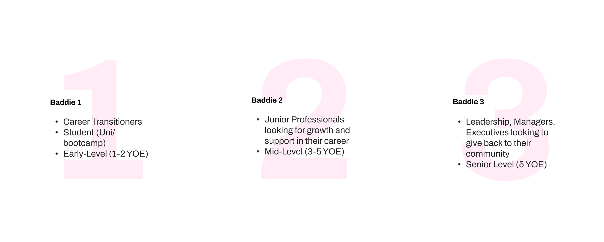
📝 Our users divided into 3 groups:
DESIGN
Familiarizing ourselves with Baddies in Tech’s existing website
Before diving into wireframing, my team conducted a homepage website review to understand the current branding and content and identify what features were effective and what was not.

DESIGN — UNPACKING RESEARCH TEAM’S USER INTERVIEW FINDINGS
The UX Research Team conducted a survey that showed “women in tech want clear, actionable steps to maintain momentum and progress in their careers.”
We considered the UX Research team's findings and brainstormed several user flows for onboarding to the website member portal. This exercise helped us identify potential edge cases before wireframing and creating the site's information architecture (IA).

Snapshot of our taskflows

Snapshot of our sitemap
After reviewing the UX Research team card sorting results, we prioritized which pages to design first. It was reassuring to know we were focusing on the right features.
BACK TO DISCOVER
Exploring our client’s platform of choice: Memberstack
Once we learned that our client wanted to use Memberstack to build the portal, my team and I researched the platform to understand it’s functionality and gather features that we thought would best serve our users. There were so many features to choose from!
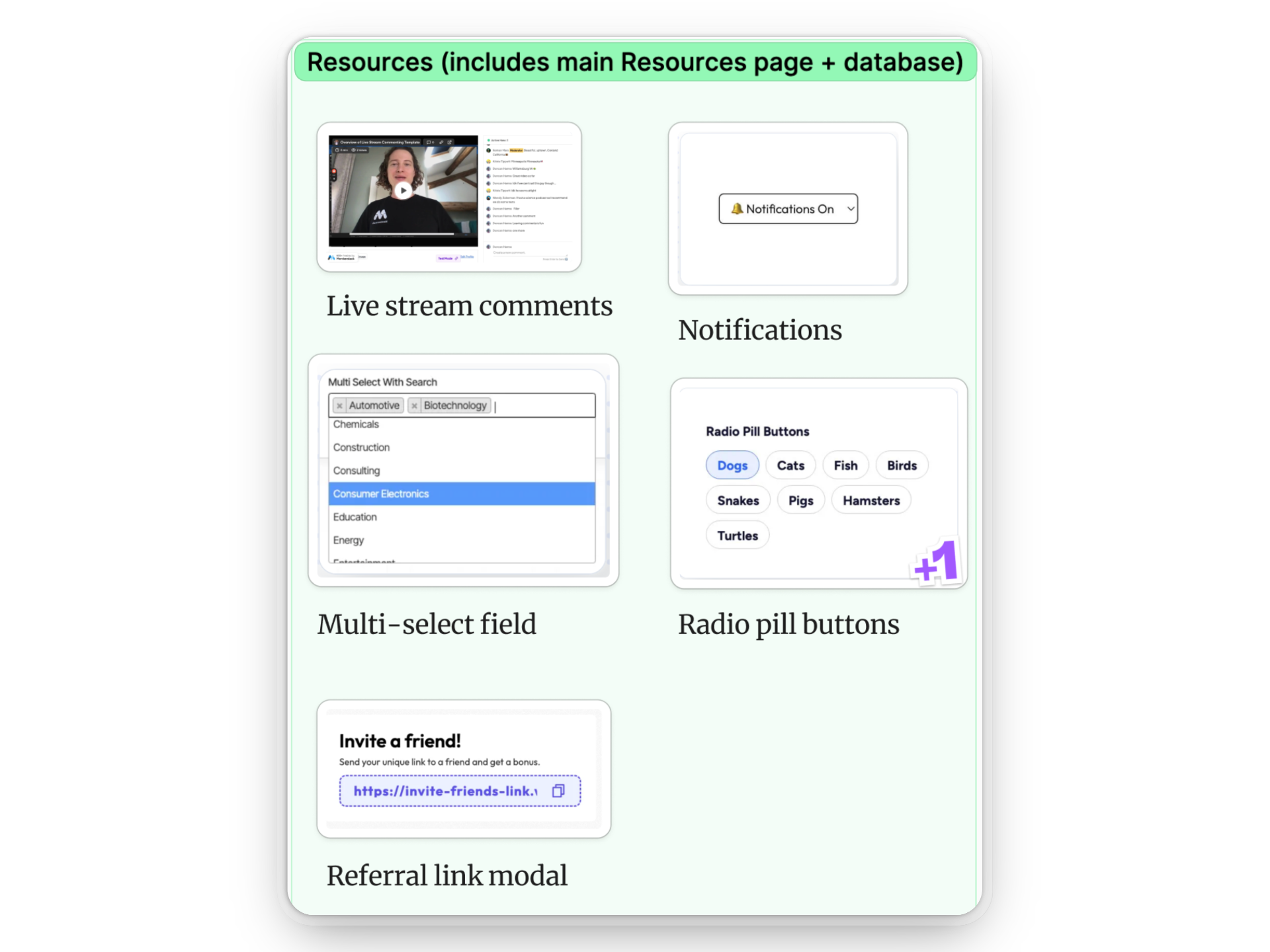
I found live stream comments interesting and believed they would create an engaging atmosphere. However, since the focus was on creating the basic building blocks, I added radio buttons to my wireframes for easy navigation.
DESIGN — WIREFRAMES
Using client features requests and UX Research card sorting results, I started to create the skeleton of the Resource page

LOW-FIDELITY WIREFRAME FEATURES
Pages → Educational Resources, Courses, Career services, Scholarships, and My Resources
Search bar → to quickly find content using keywords
Checklist → based on career track for a personalized experience for the user
After getting feedback from my UXD team, I proceeded to design the
mid-fidelity wireframes

CHANGES I MADE
Moved the checklist to the right side to avoid overwhelming the user with the navigation menu items on the left
Aligned the search bar with navigation items for easier access and a more intuitive experience
Changed the “save” button for each resource/scholarship → “apply now”
RESEARCH UPDATE
The UX Research team surveyed 22 people already in networking memberships and found that "members want guidance and are frustrated with the lack of direction."
Members are looking for
Guidance on how to find a job
Sills-building opportunities
Networking opportunities
Members pain points
Feeling frustrated about not being able to find useful information
Upon reviewing the UXR results, we were able to confirm that we were prioritizing the right features and onboarding experience.

Snapshot of the high-fidelity wireframe
Familiar layout
The design mirrors existing platforms and job/community boards, which gives the Baddie a familiar experience.
Simple navigation
Features include scannable navigation, clear labels, and industry-specific filters to help Baddies quickly locate relevant resources.
Reflections
Embrace ambiguity.
Dealing with uncertainty is normal in agile work. It's important to be flexible and improve skills while waiting for feedback from clients or teammates. If I had more time or the chance to work with this team again, I would set up meetings to ask questions and collaborate on tasks to keep the momentum going.
Let data guide decisions.
User insights shaped every design choice we made.
Done is better than perfect.
We worked in agile, so we had to move fast and make sure our developers were well-prepared, as well as future teams. With many moving parts, we learned the importance of sharing, quickly iterating, and documenting everything.
